
Amazon Best Selling Books – RStudio
Project Description
This project focuses on analyzing the dataset of the best selling books on Amazon in 2024. This dataset includes 4846 books and 907 different genres, which presents a considerable challenge in terms of structuring and interpreting the data. The main goal of the analysis was to gain useful insights into the most popular books and authors, price trends, and genre distributions.
Data Set Challenges
To overcome the large diversity of genres, broader genres (e.g. Religion, Biography, History) were created to reduce the number of genres, and those that did not fit into any of these categories were left in the “Other” category.
However, the main problem was that the “Other” category remained the largest, significantly affecting the interpretation of the analysis. For example, in some analyses, I chose to include “Other” (as in the distribution of prices by genre), while in other analyses I excluded it in order to get a clearer picture of the most common genres.
Analysis and Visualisations
library(tidyverse)df <- read_csv("amazon_books_cleaned.csv")
Top 10 Authors by Number of Books and Average Review Rating
I began the analysis by grouping books by author and calculating the number of books and average rating in order to obtain a top 10 of the most prolific authors in the dataset, ordered descending by number of books published.
author_summary <- df %>%
     group_by(Author) %>%
     summarize (
         Number_of_Books = n(),
         Average_Rating = mean(Reviews, na.rm = TRUE)
     ) %>%
     arrange(desc(Number_of_Books)) %>%
     slice_head(n = 10)
print(author_summary)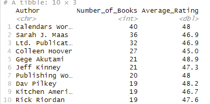
A bar (col) graph visualization was created, where on the X-axis had the authors and on the Y-axis the number of books. Each bar was labeled with the author’s average rating.
library(ggplot2)ggplot(author_sumamry, aes(x = reorder(Authot, Number_of_Books), y = Number_of_Books)) +
geom_col(fill = "steelblue") +
geom_text(aes(label = round(Average_Rating, 1)), vjust = -0.5, size = 4, color = "black") +
labs(
title = "Top 10 Authors & average Rating",
x = "Author"
y = "Number of Books"
) +
theme_minimal() +
coord_flip()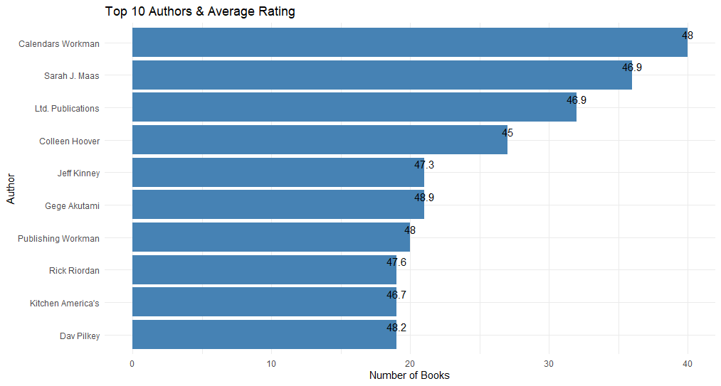
Top 10 Authors by Average Rating (Minimum 5 Books)
To ensure the relevance of the authors analyzed, I selected only those authors who published at least 5 books. The authors were ordered by the average rating of their books, and the visualization was done using a bar chart with the average rating on the X-axis and the authors on the Y-axis.
library(dplyr)
library(readr)
top_authors <- df %>%
group_by(Author) %>%
summarize(
Number_of_Books = n(),
Average_Rating = mean(Reviews, na.rm = TRUE)
) %>%
filter(Number_of_Books >=5) %>%
arrange(desc(Average_Rating)) %>%
slice_head(n= 10)ggplot(top10_authors_rating, aes(x = Average_Rating, y = reorder(Author, Average_Rating))) +
geom_col(fill = "forestgreen") +
geom_text(aes(label = round(Average_Rating, 1)),
hjust = -0.1, color = "black", size = 3.5) +
labs(
title = "Top 10 Authors bz Average Rating (min. 5 books)",
x = "Average Rating",
y = "Author"
) +
coord_cartesian(xlim = c(45, 50)) +
theme_minimal()
This visualization aimed to identify authors with the highest rated works, but who also have a significant amount of books published.
Top 10 Genres
After preprocessing the data, I got a top 10 genres by number of books. Genres were re-grouped into a broader category to reduce the number of genres and to make the analysis more coherent.
Visualization was done with a horizontal bar chart, with genres on the Y-axis and number of books on the X-axis.
df %>%
  count(Genre, sort = TRUE) %>%
  slice_max(n, n = 10) %>%
  ggplot(aes(x = reorder(Genre, n), y = n)) +
  geom_col(fill = "#6495ED") +
  coord_flip() +
  labs(title = "Top 10 Genres",
       x = "Genre",
       y = "Number of Books") +
  theme_minimal()
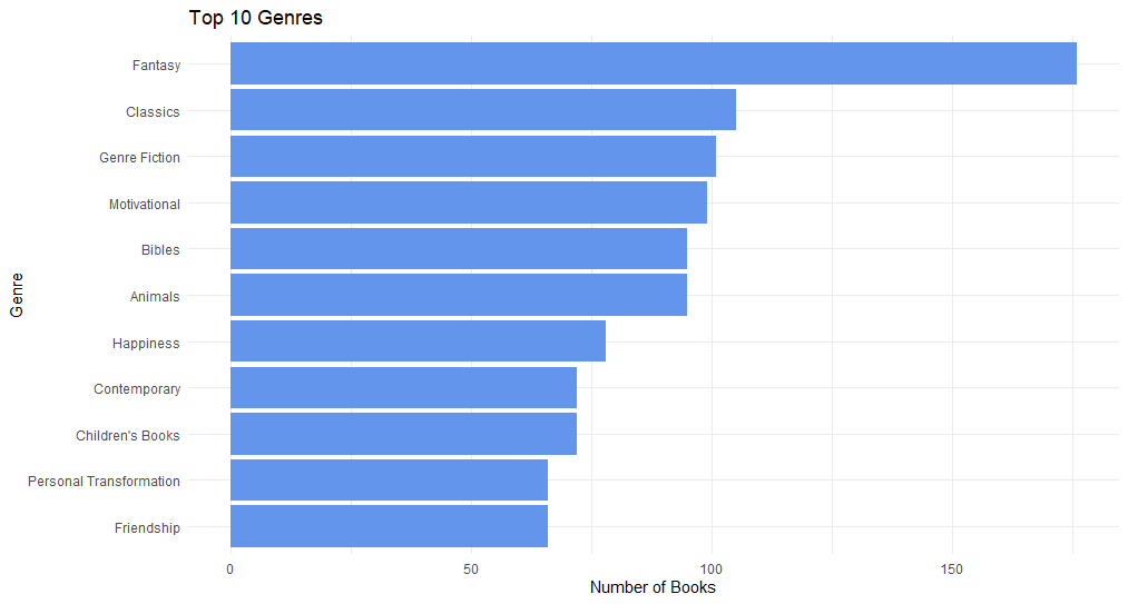
Top 10 Books with the Highest Prices
I identified the books with the highest prices and created a visualization with bar charts, where the price of the book was shown on the X-axis and the title of the book on the Y-axis.
ggplot(top_price_books, aes(x = Price, y = reorder(Title, Price))) +
     geom_col(fill = "#4db8a4") +
     geom_text(aes(label = paste0("$", round(Price, 2))),
               hjust = -0.1, size = 3.5, color = "black") +
     labs(
         title = "Top 10 Most Expensive Books",
         x = "Price(USD)",
         y = "Book Title"
     ) +
     coord_cartesian(xlim = c(0, max(top_price_books$Price) + 20)) +
     theme_minimal(base_family = "Helvetica") +
     theme(plot.title = element_text(face = "bold", size = 14),
           axis.text.y = element_text(size = 8))
Each bar was labeled with the exact price, and the X-axis was adjusted to highlight differences in book prices.
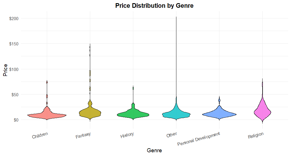
Price Distribution by Genre
A violin graph visualization was conducted to observe how book prices vary by genre. I included “Others”.
top_genres <- df %>%
  count(GeneralGenre, sort = TRUE) %>%
  slice_head(n = 6) %>%
  pull(GeneralGenre)

df_violin <- df %>%
  filter(GeneralGenre %in% top_genres)
ggplot(df_violin, aes(x = GeneralGenre, y = Price, fill = GeneralGenre)) +
geom_violin(trim = FALSE, color = "black", alpha = 0.8) +
scale_y_continuous(labels = scales::dollar_format(prefix = "$")) +
labs(title = "Price Distribution by Genre",
x = "Genre",
y = "Price",
fill = "Genre") +
theme_minimal(base_size = 14) +
theme(
plot.title = element_text(face = "bold", hjust = 0.5),
legend.position = "none",
axis.text.x = element_text(angle = 15, hjust = 1)
)
Page Count Distribution by Genre
Conducted an analysis of book length by genre using boxplots. The “Other” genre was excluded to avoid skewing the data. This visualization helped to observe patterns in book length by genre typology.
df_filtered <- df %>% filter(GeneralGenre != "Other")ggplot(df_filtered, aes(x = GeneralGenre, y = `Number of Pages`)) +
geom_boxplot(fill = "lightblue", color = "black") +
theme_minimal() +
theme(axis.text.x = element_text(angle = 45, hjust = 1)) +
labs(
title = "Book Length by Genre (Excluding 'Other')",
x = "Genre",
y = "Number of Pages"
)

- Authors with many books published, but not necessarily high average ratings. Steady activity suggests a strong market presence.
- Authors with fewer books may have excellent average ratings, indicating a strong reputation for quality.
- There is wide variability in prices by genre, with premium books in certain categories (e.g. Biography, History).
- Popular genres such as Fiction and Self-help dominate the market (when “Other” was excluded) otherwise “Other” is dominant, affecting analysis, and suggests the need for better categorization of genres.
- More expensive books are usually longer, but there is not a strong correlation between price and length. Popular genres are usually shorter and more affordable.